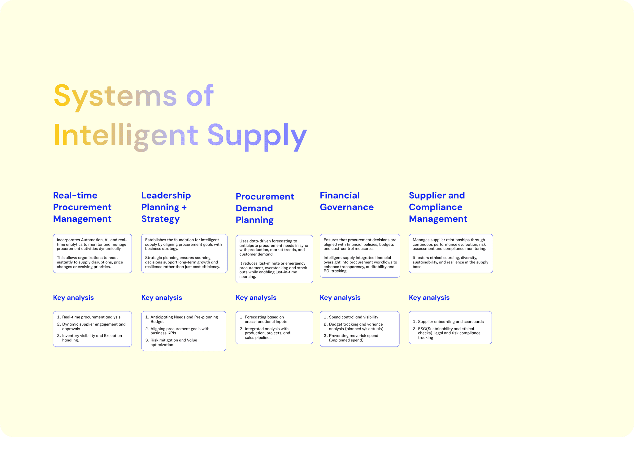
A.I Driven
Decision Intelligence and
Visualization

A.I Driven
Decision Intelligence and
Visualization

Use this templte

2 Years, 2024-Present

2 Years, 2023-25

Use this templte

Use this templte

KEY FOCUS

Product Strategy

Service Design

Data Visualization

A.I Design Patterns

Design Systems

Design Documentation

Usability Testing

I lead a team of 3 and worked on visualisation and development of Spend tool for Procurement. My work in managing the design system ensured consistent user experience and alignment with brand guidelines. I also helped streamline design system documentation for easier adoption across teams.


As a Senior UX Designer, I led the design of a next-generation spend report tool for a supply chain management dashboard aimed at improving visibility, efficiency, and control in enterprise procurement. My role spanned from discovery to delivery — including stakeholder workshops, workflow mapping, data visualization, and interface design. I collaborated closely with product managers, data analysts, and developers to craft a user-centric solution that made complex procurement data actionable through automated workflows, AI-driven insights, and a modular, scalable design system.

I lead a team of 3 and worked on visualisation and development of Spend tool for Procurement. My work in managing the design system ensured consistent user experience and alignment with brand guidelines. I also helped streamline design system documentation for easier adoption across teams.

As a Senior UX Designer, I led the design of a next-generation spend report tool for a supply chain management dashboard aimed at improving visibility, efficiency, and control in enterprise procurement. My role spanned from discovery to delivery — including stakeholder workshops, workflow mapping, data visualization, and interface design. I collaborated closely with product managers, data analysts, and developers to craft a user-centric solution that made complex procurement data actionable through automated workflows, AI-driven insights, and a modular, scalable design system.

Streamlining Strategy: From Automation to Design Harmony

I contributed to automating critical workflows, improving operational efficiency across processes. I supported the development of intuitive dashboards that helped teams access key spend insights at a glance.

Streamlining Strategy: From Automation to Design Harmony

I contributed to automating critical workflows, improving operational efficiency across processes. I supported the development of intuitive dashboards that helped teams access key spend insights at a glance.

Automated Workflow
The Command Centre

Automated Workflow
The Command Centre

Design Ops

Design Ops

The Command Center is a centralized control layer designed to give supply chain and procurement teams real-time visibility, intelligent alerts, and decision support. It unifies multiple operational tools into a single, action-oriented interface — enabling faster response, reduced downtime, and proactive issue resolution across complex systems.


We transitioned from Excel (manual tracking) to Tableau (better visuals), then to Power BI (real-time reporting). As needs evolved, we built a custom Command Center — a unified, interactive platform with advanced analytics, automation, and workflow control tailored for complex procurement operations.

18%

Automation in the command centre reduced manual processing time by 18% (measured by comparing average task completion times before and after automation rollout).

15%

Command centre digitization improved process visibility by 15% (tracked via reduction in blind spots in monthly audit reports).

12%

12%

Transitioning from individual analysis to system-level flow maps improved cross-team alignment by 12% (measured through reduced inter-departmental escalation cases).

From Procurement to Intelligent Supply

From Procurement to Intelligent Supply

From excel to tableau to power bi to customized command center

From excel to tableau to power bi to customized command center

A.I Design

Pattern

A.I Design Pattern

What began as a procurement-focused solution evolved into a holistic Intelligent Supply Platform. We expanded the scope to include Leadership Planning & Strategy, Procurement Demand Planning, Real-time Procurement Management, Financial Governance, and Supplier & Compliance Management. This shift transformed the tool from a transactional dashboard into a strategic command layer — enabling proactive decision-making, end-to-end visibility, and alignment across supply chain, finance, and procurement functions.

What began as a procurement-focused solution evolved into a holistic Intelligent Supply Platform. We expanded the scope to include Leadership Planning & Strategy, Procurement Demand Planning, Real-time Procurement Management, Financial Governance, and Supplier & Compliance Management. This shift transformed the tool from a transactional dashboard into a strategic command layer — enabling proactive decision-making, end-to-end visibility, and alignment across supply chain, finance, and procurement functions.

13%

Dashboards with recommendations increased decision adoption rates by 13% (measured by tracking usage of recommended actions).

16%

Automated anomaly detection cut false positives by 16% (measured by comparing flagged vs. validated anomalies).

12%

12%

Forecasting accuracy improved by 12% (calculated using historical vs. predicted spend variances).

Handling Data Density,
Dig Deeper, Decide Smarter

Handling Data Density,
Dig Deeper, Decide Smarter

The UX of Showing Complex Data Without Creating Chaos

The UX of Showing Complex Data Without Creating Chaos

Data

Design

A.I Design Pattern

To enable actionable decision-making, we designed interactive visualizations that allowed users to explore data at multiple levels — from high-level spend overviews to granular supplier transactions. Each chart or KPI tile supported drill-down interactions, enabling users to filter by category, geography, supplier, or timeframe in real time. Hover states, clickable elements, and dynamic filters revealed contextual insights without overwhelming the main interface. This layered approach empowered users to shift from monitoring to root-cause analysis seamlessly, driving faster and more informed decisions across procurement and supply chain teams.

To enable actionable decision-making, we designed interactive visualizations that allowed users to explore data at multiple levels — from high-level spend overviews to granular supplier transactions. Each chart or KPI tile supported drill-down interactions, enabling users to filter by category, geography, supplier, or timeframe in real time. Hover states, clickable elements, and dynamic filters revealed contextual insights without overwhelming the main interface. This layered approach empowered users to shift from monitoring to root-cause analysis seamlessly, driving faster and more informed decisions across procurement and supply chain teams.

9%

Optimized table structures cut data retrieval time by 9% (measured through load time benchmarks).

12%

Smarter filters improved search success rates by 12% (measured by reduction in “no result” queries).

8%

8%

Refined graph standards improved interpretation accuracy by 8% (measured in user comprehension tests).

Designing for Engineers
Design Maintenance

Designing for Engineers
Design Maintenance

Adaptable, Scalable Fluid Design Systems

Adaptable, Scalable Fluid Design Systems

Design

Management

A.I Design Pattern

To support developers, we focused on clarity, speed, and flexibility. Inline documentation, tooltips, and customizable UI elements reduced context-switching, while features like an API explorer, keyboard shortcuts, and code-friendly data exports (JSON/CSV) enabled faster workflows. We also embedded component-level logs, version history, and design tokens to aid debugging and implementation. Seamless Figma-to-dev handoff, along with dev-ready docs and a shared component library, ensured consistency and efficiency across teams — making the platform not just developer-friendly, but developer-empowering.

To support developers, we focused on clarity, speed, and flexibility. Inline documentation, tooltips, and customizable UI elements reduced context-switching, while features like an API explorer, keyboard shortcuts, and code-friendly data exports (JSON/CSV) enabled faster workflows. We also embedded component-level logs, version history, and design tokens to aid debugging and implementation. Seamless Figma-to-dev handoff, along with dev-ready docs and a shared component library, ensured consistency and efficiency across teams — making the platform not just developer-friendly, but developer-empowering.

18%

Documentation reduced onboarding for analytics teams by 18% (measured via time-to-first-project delivery).

12%

Fluid layouts improved task success on mobile by 12% (measured via usability testing task completion).

14%

14%

Regular audits improved defect detection by 14% (measured by issue logs pre- and post-audit cycles).